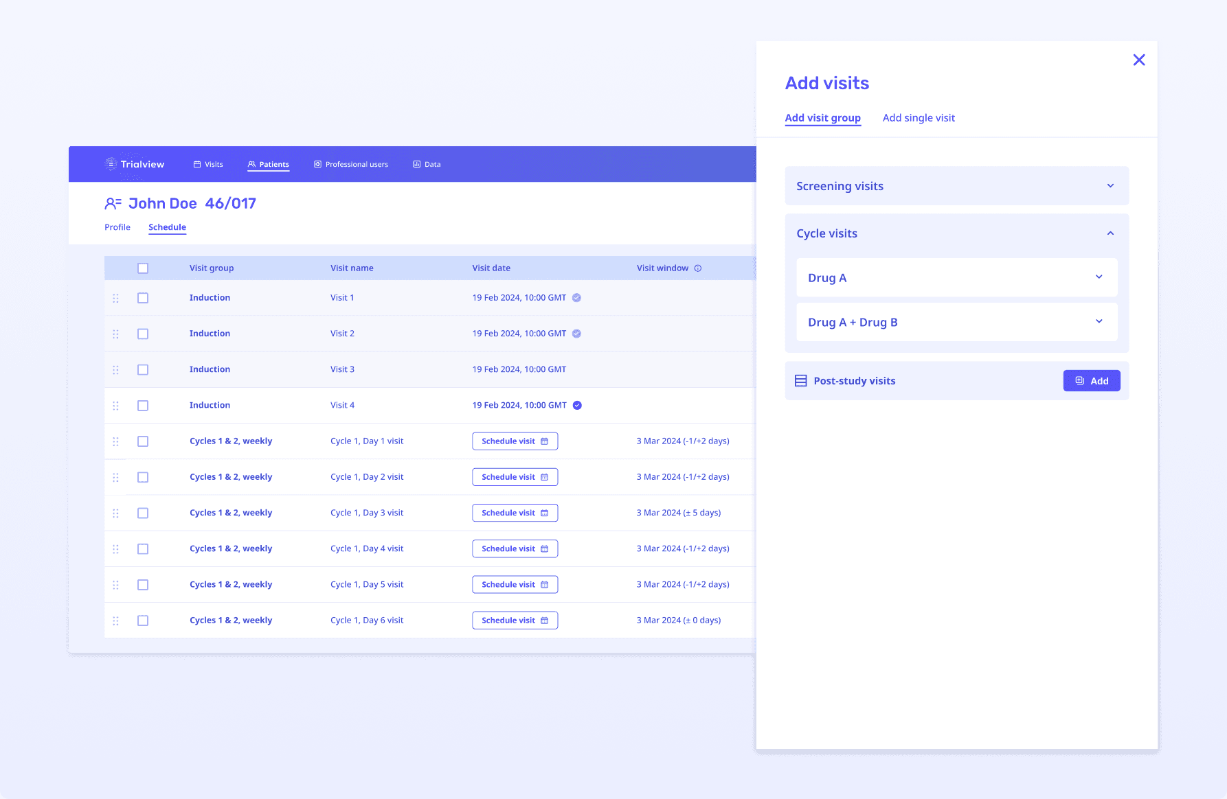
Stitch’s current menu to add visits could not support this new trial.
The new trial had a very complex visit schedule, containing 40 groups of visits. Some visit groups were nested in other groups.
Our menu could only display a total of 11 visit groups. We also did not have a way to display nested groups.
Without redesigning the visit menu, we would not be able to serve this new client, or other future clients running trials with complex visit schedules.
The old visit menu design
Approach 1: Modals and dropdowns
At the start of the design process, I asked myself: What is the simplest design pattern I could explore?
My initial approach used modals and dropdowns — a familiar pattern for Trialview users. Dropdowns are versatile, handling both small and large quantities of visit groups.
However, with a large number of visit groups, finding a specific one could become challenging for users.
I shared these wireframes with our product and engineering teams. They shared my concerns and also felt the modal approach was not the strongest way to visually show groups that are nested in other groups.
Approach 2: Side panel
Taking this feedback on, I next explored a side panel design.
The design shows the relationship between nested groups with vertical lines.
Users could expand and minimise groups to see the visits contained in the groups, making it easier to quickly validate or undo a selection if it was incorrect.
This design was stronger as it better fulfils the product and design requirements.
Lo-fidelity to hi-fidelity
After sharing the side panel designs in our design review, our team felt confident that this was the right approach. So we progressed this solution into hi-fidelity designs.
I worked with our UI designer to iterate on the hi-fidelity designs.
The following improvements were added:
Users could switch between tabs depending on whether they wanted to add a group of visits or a single visit, saving users an extra 3 clicks from the original menu design.
The nesting motif was further enhanced through the use of alternating background colours.
Re-designed visit menu
Existing clients were very happy with the new menu design and how it would be much clearer for sites to add new visits to patient schedules.
For our new client, we were able to implement the trial without the menu being a blocker. This functionality then enabled us to implement 4 additional trials with complex trial design.
We have also been able to maintain our 100% implementation satisfaction rate with our clients as a result of this redesign.
Quote from our Head of Customer Success
“Showed [redacted] from CRUK the new visit group set up and they really liked it! Said how much clearer it would be for sites so well done everyone 👏🎉”


